
Traffic and buying intent are different
A website may receive visitors who are researching, comparing, looking for a job or already seeking customer support. Visits alone do not reveal purchase intent. Separate traffic by landing page, source and the question that brought the visitor there. A popular informational article may deserve a useful service link without being expected to convert like a commercial landing page.
Your offer may be unclear
On the first screen, a potential customer should be able to answer: what does this business do, who is it for, and what should I do next? Replace generic slogans with specific language based on the customer's problem. A website for a specialist clinic, for example, should explain services and next steps instead of only presenting a dramatic photograph.
Trust has to be earned on the page
Visitors will look for real work, relevant experience, accurate contact details, professional photography, and clear explanations of scope. Avoid using anonymous testimonials or invented results. If a project example is a concept, do not imply it was commissioned by the depicted company.
Your next action may be broken or expensive
Test contact forms, phone links, WhatsApp links, booking and checkout on real mobile screens. Ask only for information needed at that stage, and ensure the submission reaches someone who can respond. An attractive CTA that goes nowhere is worse than a simple working contact link.
For advertising campaigns, keep the landing page focused on one offer. Confirm how leads are qualified before spending on cheap form submissions that sales cannot convert.
Measurement can hide the real issue
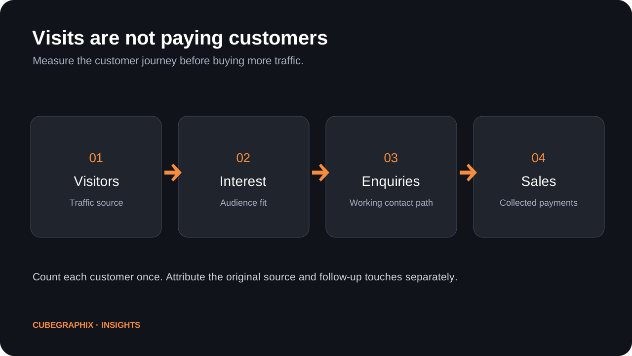
Confirm which events your analytics count. A button click is not the same as a received enquiry; an enquiry is not a sales-qualified lead; and a proposal is not revenue. Measure each stage separately. Preserve campaign source and original landing page through the sales process where possible, and avoid attributing the same customer twice when discovery and follow-up tools both touched the opportunity.
A practical sequence of fixes
- Test the entire contact or purchase path.
- Clarify headline, offer and audience fit.
- Replace unsupported claims with authentic evidence.
- Remove unnecessary form fields and confusing navigation.
- Ensure mobile readability and practical loading performance.
- Check the analytics source-to-qualified-lead chain before increasing advertising spend.
Diagnose the funnel with a small, honest worksheet
Start by defining the visitor’s intended action rather than assuming that every session should become a sale. A buyer researching a technical topic may be months away from choosing a provider; a visitor searching the exact service and city may be ready to enquire. Separate landing pages and campaign sources before calculating any conversion ratio. A blog article, branded search, referral link and paid social creative represent different contexts, even when they land on the same website.
For each source and landing page, record the number of visits with known measurement limitations, meaningful contact actions, enquiries actually received, qualified opportunities, proposals and collected payments. A high click count on a WhatsApp button is not a confirmed conversation; an email-form preview is not a sent email. Require delivery confirmation or a reconciled provider event before calling it a lead. When one prospect first received a sales email and later returned via an Instagram post, preserve both interactions against one prospect ID instead of counting two new customers.
A simple qualitative diagnosis is often faster than a sophisticated heatmap. Open the site on a phone, find the relevant service, follow the obvious CTA and attempt to contact the business. Note where you hesitate or cannot continue. Test under realistic network conditions and with keyboard navigation. Confirm the contact details are accurate, that forms request only necessary information and that the acknowledgement does not imply successful delivery when the underlying action merely opens a local mail client.
Use the worksheet to prioritize a specific test: unclear hero → rewrite the promise; hidden contact button → make the next step visible; broken mobile form → repair delivery; irrelevant paid traffic → adjust audience and ad promise; weak proof → add source-backed project examples. Avoid changing every variable simultaneously if you need to learn what helped. Each proposed fix should have a measurable acceptance criterion and an owner responsible for verifying it.
What trustworthy evidence looks like on a service page
Trust is not a decorative testimonial carousel. A specialist service business needs to show enough authentic information for a buyer to understand risk and competence. That may include named professionals with verified qualifications, genuine project photographs, clear geographic coverage, relevant case details, realistic process steps, approved customer statements and explicit service boundaries. The evidence should fit the purchase decision. A roofing customer may care about completed nearby projects, warranty scope and how quotes are requested; a professional advisory buyer may care about responsible people, industries served and a clear description of deliverables.
Make the proof inspectable. A before-and-after design concept can show an approach to visual communication, but it cannot prove a percentage increase in conversion unless the underlying event data supports it. A fictional demonstration should be labeled appropriately, without making the depicted business appear to be a paid client. Do not invent star ratings or imply third-party platforms endorsed the company. Where permission is needed for photographs, names or testimonials, secure it before publishing.
Position evidence close to the decision it supports. A concise summary of work near the primary service description may be more useful than fifteen unrelated quotes buried at the bottom of a long page. A pricing or monthly-plan section should clarify scope, commitments and ownership instead of hiding material conditions. And a contact page should explain what happens after submitting details, so the visitor does not have to guess whether they will receive a proposal, a call or a design concept.
A realistic 30-day conversion improvement experiment
Week 1: establish the baseline. Identify the highest-value service pages and sources of meaningful traffic. Independently test contact delivery and gather the existing enquiry history. If no usable baseline exists, record that limitation rather than inventing a historical conversion rate. Interview one or two recent qualified prospects if possible about what made the offer clear or confusing.
Week 2: fix critical friction. Repair broken actions, misleading contact confirmations, mobile overflow and incorrect service details. Make the hero answer who the business serves and what it delivers. Keep a dated change log so later results can be compared to actual work. When the existing design is already reliable, avoid a full rebuild just to make a simple improvement.
Week 3: strengthen proof and simplify choice. Add a real project example, clarify a common objection, reduce unnecessary form friction and make the main CTA visible at sensible points in the page. Check readability on narrow devices. An inquiry CTA should be easy to find but not appear as an interruptive modal every few seconds.
Week 4: assess evidence. Review received and qualified enquiries, source mix, sales responses and any available first-party behavior data. If sample sizes are small, treat changes as directional, not statistical proof. Decide whether the next iteration should focus on the offer, traffic quality, contact process or page design. This is also the point to compare the cost of new advertising against improving the leads already reaching the site.
The practical lesson is that paid acquisition and website improvement must advance together. Buying visits for a site that cannot receive enquiries increases waste; endlessly polishing a website without showing it to suitable buyers produces little learning. A focused cycle tests both the customer promise and the working contact journey before scaling budget.
Further reading and source material
These references support the technical guidance and provide context for further verification.
- Google Analytics — measurement events
- web.dev — forms and user experience
- Google Search Central — creating helpful content
Improve the website, not just the metrics.
CubeGraphiX helps businesses identify and address practical website, search and conversion problems. Start with a short description of your business and goals.
Request a website review ↗